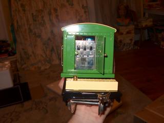
Here's the control panel. I know this may sound a little nitpicky but I do wish the styling was a little more prewar (in the control panel).
Make no mistake, the control panel is nice but it would have been a nice touch to have little levers with little bits of red paint at the ends.
The switches themselves are nothing to write home about. I am not sure they will look so good in 70 or 80 years. Yes, I expect a piece of tinplate to last at least that long. Long after I drop dead, this thing should still be hoisting imaginary loads over a layout.
Also, one more thing; MTH labeled the controls with hand applied decals. Decals that look like they were printed on an inkjet printer. A cheap inkjet printer.
It absolutely amazes me that a company that makes such an absolutely choice piece of tinplate skimps on something silly like labeling. Maybe some paint and a stencil in the next go around?
By the way, did I say that this isn't a review? It's a first impression. Don't let me fool ya, this is a damn nice item.
More in the next article.
M
No comments:
Post a Comment